This week we learned about the 4 principles of design: Contrast, Repetition, Alignment and Design. I will show each of these principles used in an ad by Ford for their Ford Edge.

Link: Ford Ad
Ad Information
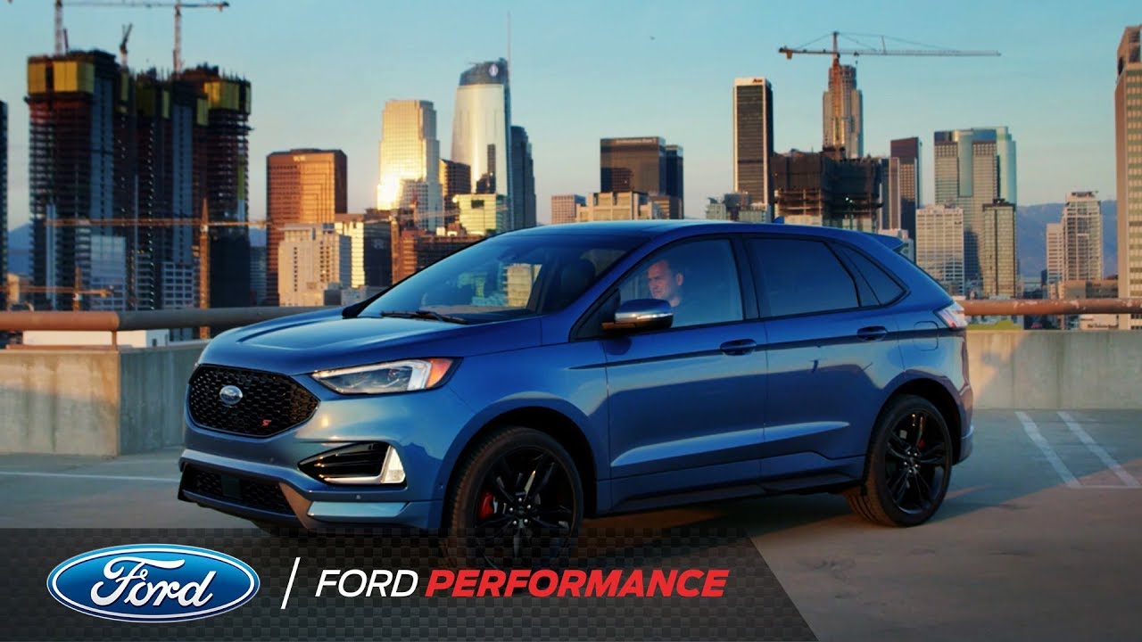
This still shot is taken from a You Tube Video on the Ford Performance Page. You can find the full video here: https://www.youtube.com/watch?v=RZrTyIdOj4M. The video was created by Ford to show the performance ability of the new Ford Edge ST. The Ford Performance YouTube channel has over 310,000 subscribers.
Design Analysis
Contrast
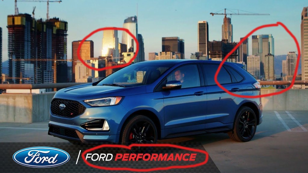
Per our reading this week, we learned that contrast is something in the ad that our eyes are drawn to. In this picture we see contrast multiple times. We see it in the sun reflecting on the buildings in the back. It is in the color difference between the building, the light blue sky and then the darker blue Ford. The white and red used in Ford Performance at the bottom also draws our eye to this text. When they created this ad, they wanted the reader to think that this car, the Ford Edge is associated with performance.
Repetition
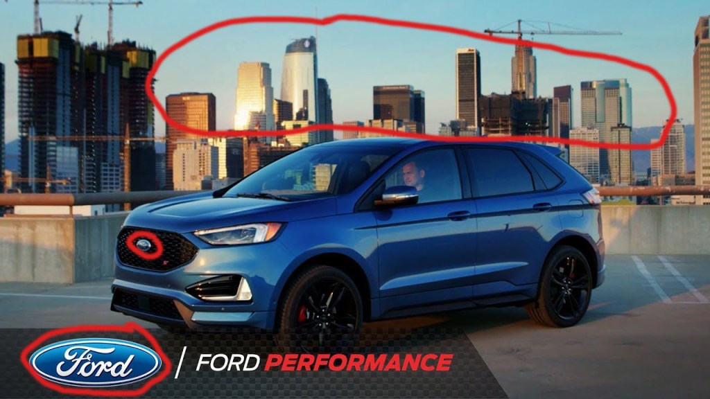
Repetition in design helps tie the page together. In this ad, the buildings are used for repetition as the backdrop to the car. We can also see repetition in the Ford logo which is not only on the car, but it is on the bottom of the ad.
Alignment
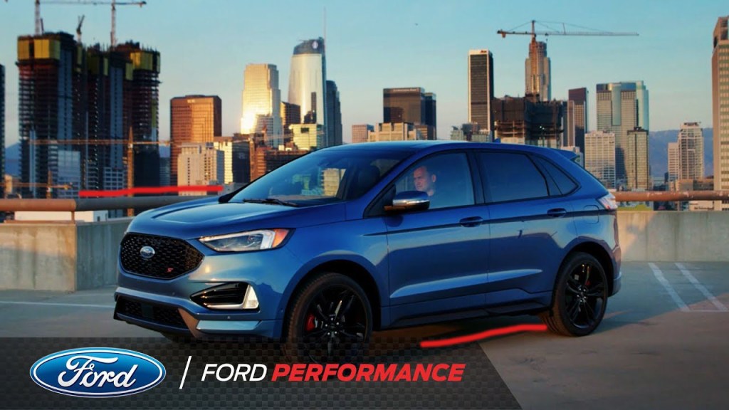
We learned this week that we should not place things wherever we want on a page, they should be placed so that they line up with other elements to make the design look better. In this design, we have the car parked at an angle, and if you notice the parking lot also angles back on the left side of the picture. The placement of the car in front of the buildings makes the car stick out. If it were parked straight on, you would not see the whole car and it would blend in. This way, the car is the focal point of the ad.
Proximity
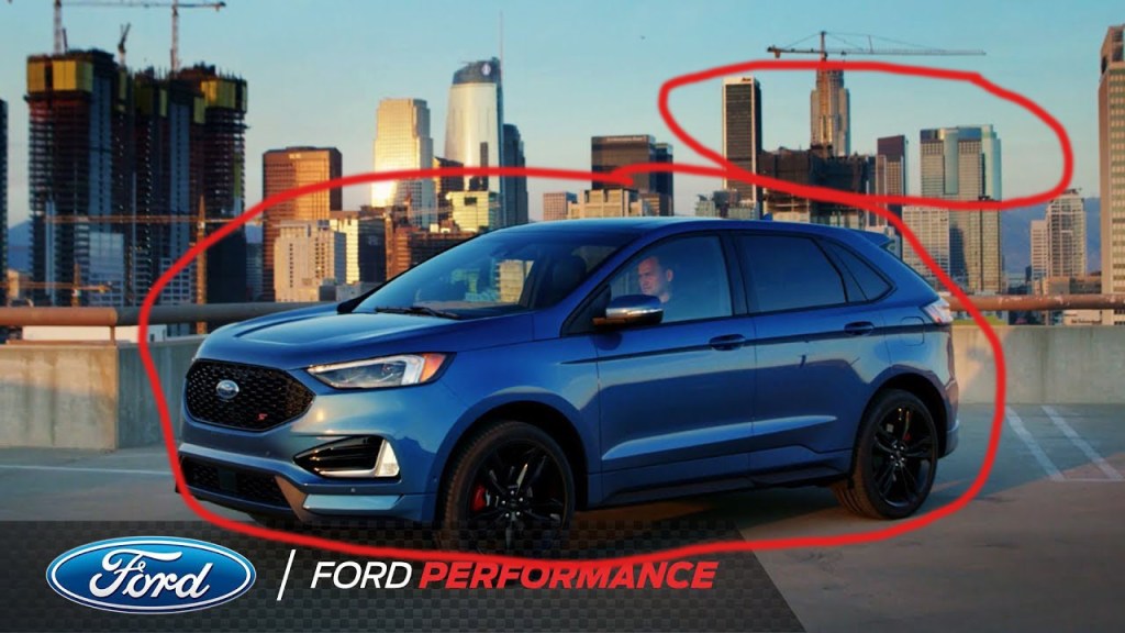
Proximity helps to organize the ad and make is pleasing to look at. This ad shows the car angled slightly in the parking lot with the buildings in the back. By putting the car in the front and making it larger with the cityscape in the back, it shows just what the creator wanted me to see, the Ford first and then the cityscape. We also see the Ford logo and Ford Performance at the bottom in close proximity to the car. This helps me as a viewer to associate Ford cars with Performance as previously stated.
Conclusion:
I like this ad created by Ford. First off, the light blue sky with the darker blue car creates a pleasing contrast. The way they have added Ford Performance at the bottom of the ad helps me to know that this Ford is associated with performance. By placing the car in front of the cityscape, it stands out and it is the bigger item in the picture that you look at first, even though the buildings are much bigger in actual life. This ad is simple, without a lot of text, but I feel like it got the point across simply. Ford cars are associated with performance.
