
Introduction
This 2 page spread comes from Cake Decorating magazine by DeAgostini. It is a how-to magazine on cake decorating. This 2 page spread deals with making carrot cake and decorating it. https://www.deagostini.com/uk/collections/cakedecorating/
Typeface Category
There are two types of typeface used in this article. The first is the script used in the main header and all the sub-headers. You can identify the script because it looks like cursive and makes it looks fancier than the other type. The second typeface used in the article is a sans serif. We learn in our design book that sans serif is a monoweight, which means it does not have the heavier and light strokes, it just has one weight to the strokes.
Contrasting Elements in Typeface
The script used in this article is at the top of each new section. It is a fancier type and it sets the header apart from the sans serif type that is used in the body of text. They have also used different color text blocks for each new section, which helps with the contrast of the two different typefaces. The script is soft on the eyes and makes the carrot cake seem homemade and adds a contrast to the sans serif. If they just used sans serif, the page would be boring and the different sections would not stand out.
Depth of Field
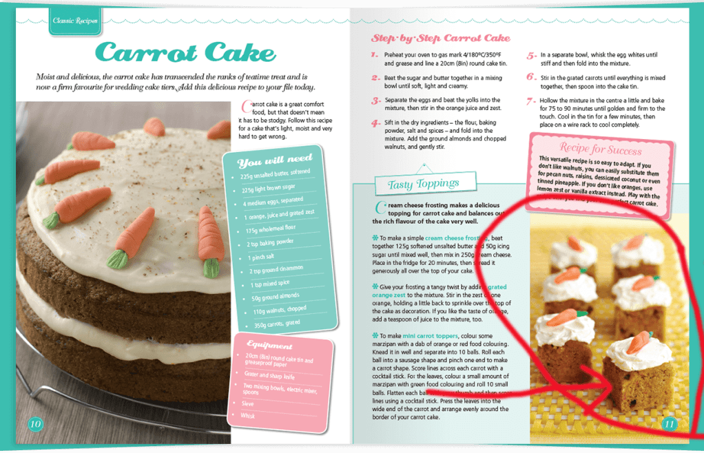
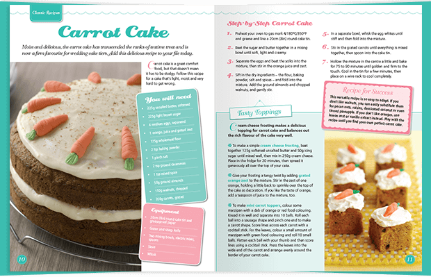
The photographer used shallow depth of field in this picture. The front pieces of carrot cake are in focus, while the back pieces are blurry. This helps the reader to focus on those front pieces of carrot cake. The reader is still aware of the back pieces of carrot cake, but the readers eyes will go to the front pieces which are in focus.
Alternate Images
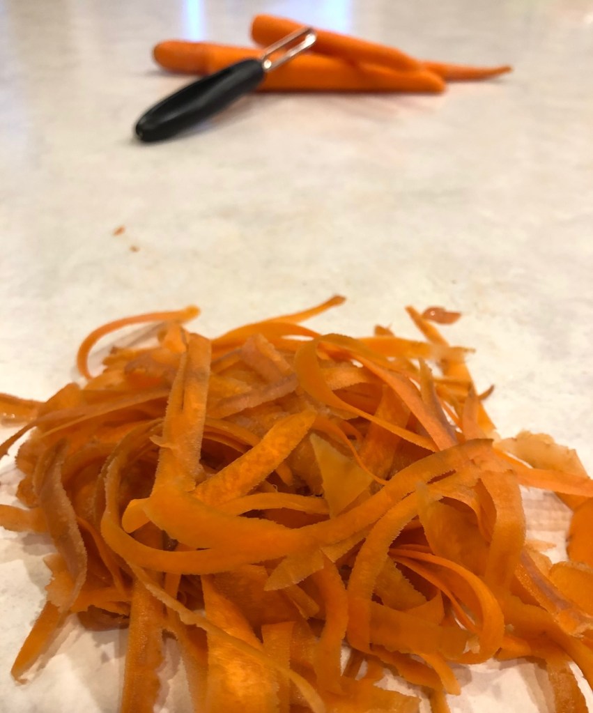
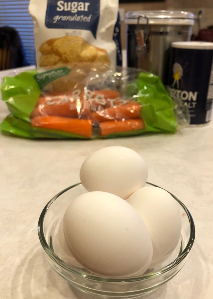
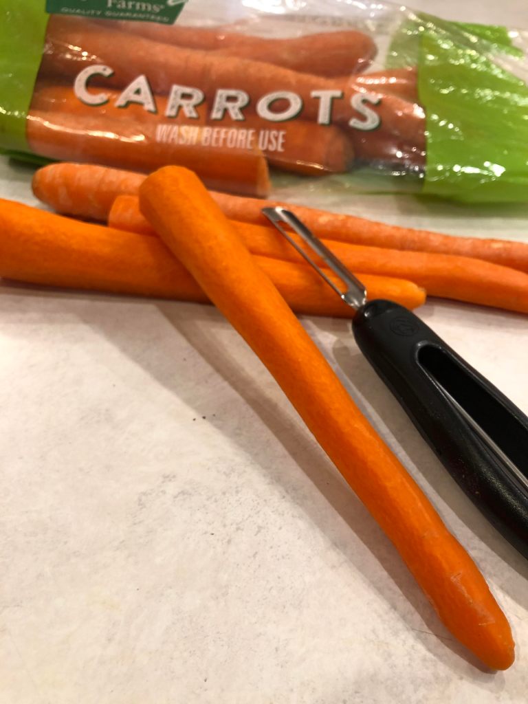
The three above images can be switched for the small pieces of carrot cake. The first picture shows fresh carrot peelings; showing that this recipe will have fresh carrots in it. The next picture shows ingredients to help make the cake. Since this page has a recipe on it, this could go in place of the finished pieces of cake, since we have a picture of the full cake on the right. The last picture is another picture of the peeled carrots. This tells the reader that this cake is homemade with fresh carrots. All three pictures represent the recipe on the page and all three have a shallow depth of field; the picture in the front is in focus and the back images are blurry.
Summary
When I look at this layout, it makes me want to make and eat this carrot cake, because I find it very appealing. The author wants this to be appealing; they are selling the customer on how they can make and decorate this carrot cake. The depth of field in the picture with the small pieces of cake takes your eyes to that front piece of carrot cake. The top of the carrot cake has a carrot created out of frosting, this is where the author wants your eyes to go. She is teaching you how to make this cake and decorate it, so it is appealing to your appetite and your eyes. I also think by combining the script with the sans serif, the typeface is not overbearing.The script is not a super fancy script, it almost looks like a basic handwritten cursive, it helps the page look nice, but not overly fancy or to much to look at it. The colors added into the layout also make the typeface stand out. I find the overall appearance of this add appealing to both the eyes and the stomach.
