
Introduction
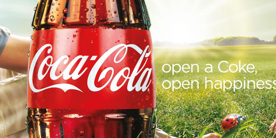
This Coca-Cola Ad is part of a global marketing Campaign that came out in the first half of 2009. Per Wikipedia the campaign was developed by the Wieden & Kennedy creative agency. I obtained this ad from Google. Coca Cola Google Ad
Design: Contrast
Let’s talk about contrast. In The Non-Deisgner’s Design Book by Robin Williams, she states that “Contrast is one of the most effective ways to add visual interest to your page. ” We also learned that contrast helps to organize information. The contrast used in this Coca-Cola add makes this ad stand out. First, they have a Coca-Cola bottle right in front of the bright sun. The sun radiates around the bottle and not only highlights the bottle, but it highlights everything around it; the grass, the ladybug and the trees in the background. Another way they add contrast is the white lettering against the red band on the bottle, and the white lettering on the green grass. The bright green grass also contrasts next to the brown in the Coca-Cola and the red on the bottle.
Color
The Coca-Cola label itself stands out because of its colors. The bright white on the red stands out and it is the first thing you see because the red is so bold. The red ladybug stands out on the green grass. The green grass is also a bright color which brings to mind spring or summer. The brightness of the sun in the picture makes the colors even brighter. The white text on these bright colors makes the text stand out and calls your attention to it. These bright colors are happy colors and make you want to be outside drinking a Coke, which is what the advertiser wants you to do.
Typography
Typography helps us know what the designer wants us to know. In this ad, the Coca-Cola logo is done in a nice flowing script. It is free and kind of fancy. When placed on the bright red band, it calls your attention to it. The sans-serif font on the side is simple, yet tells a story. This text tells us that when you open a Coke, you will be happy. The white text stands out on both the red and green that they are on. The logo is in a bolder font and draws your eye to that first, then the simpler sans-serif on the side tells you why you want that Coke.
New Coca-Cola Ad
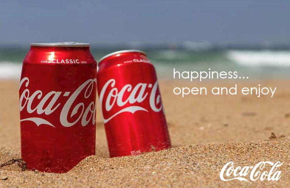
Contrast
There is contrast with the red cans on the brown sand and the ocean and the sky in the background. The cans also have light on them; appearing to be sunlight which lights up the cans and makes them contrast more with their background. There is also contrast with the blue sky and the blue/green water and the brown sand as they appear to be in rows. The water also has some white foam in it which stands out. The white font stands out and leads your eye to the words.
Color
In my ad, the bright red from the cans with the white logo from Coca-Cola stands out. Then you have the brown sand, the greenish blue water and the blue skies. These colors are calming and relaxing and warm. This appeals to people because it reminds them of summer. People love to spend time on the beach with family and friends. These all contrast with the white font; helping the font to stand out.
Typography
I have tried to recreate the typography used in the original ad at the top of the page. I have added the Coca-Cola logo, the same on the can in the bottom right corner and put a Sans-Serif font to the right of the cans. Your eye is drawn to the script first on the logo, and then to the sans-serif on the side. The sans-serif is simple and in two lines, tells you what the makers of Coca-Cola want you to know. Coca-Cola makes you happy.
Conclusion
When Coca-Cola had these ads made, they clearly wanted everyone to associate happiness with drinking a Coca-Cola. The first ad I have shown above associates Coca-Cola with someone sitting on grass, maybe with another person, on a bright sunny day. They are enjoying the beautiful sunshine and enjoying a Coca-Cola together. They tell you if you open a Coke, you will find happiness. On the new ad I created, it shows two cans of Coca-Cola on a beach. They are bright against the sand and the water in the background. A lot of people associate the beach, with vacation or relaxation, or just pure fun. Here you can open a Coke and enjoy your time on the beach. By showing another location where people find happiness, is how these two ads go together. They show no matter where you are, you can enjoy a Coke and that will make you happy.
