Welcome to Trisha’s Place

Be yourself; Everyone else is already taken.
— Oscar Wilde.
This is the first post on my new blog. I’m just getting this new blog going, so stay tuned for more. Subscribe below to get notified when I post new updates.
Be yourself; Everyone else is already taken.
— Oscar Wilde.
This is the first post on my new blog. I’m just getting this new blog going, so stay tuned for more. Subscribe below to get notified when I post new updates.
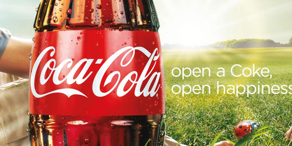

This Coca-Cola Ad is part of a global marketing Campaign that came out in the first half of 2009. Per Wikipedia the campaign was developed by the Wieden & Kennedy creative agency. I obtained this ad from Google. Coca Cola Google Ad
Let’s talk about contrast. In The Non-Deisgner’s Design Book by Robin Williams, she states that “Contrast is one of the most effective ways to add visual interest to your page. ” We also learned that contrast helps to organize information. The contrast used in this Coca-Cola add makes this ad stand out. First, they have a Coca-Cola bottle right in front of the bright sun. The sun radiates around the bottle and not only highlights the bottle, but it highlights everything around it; the grass, the ladybug and the trees in the background. Another way they add contrast is the white lettering against the red band on the bottle, and the white lettering on the green grass. The bright green grass also contrasts next to the brown in the Coca-Cola and the red on the bottle.
The Coca-Cola label itself stands out because of its colors. The bright white on the red stands out and it is the first thing you see because the red is so bold. The red ladybug stands out on the green grass. The green grass is also a bright color which brings to mind spring or summer. The brightness of the sun in the picture makes the colors even brighter. The white text on these bright colors makes the text stand out and calls your attention to it. These bright colors are happy colors and make you want to be outside drinking a Coke, which is what the advertiser wants you to do.
Typography helps us know what the designer wants us to know. In this ad, the Coca-Cola logo is done in a nice flowing script. It is free and kind of fancy. When placed on the bright red band, it calls your attention to it. The sans-serif font on the side is simple, yet tells a story. This text tells us that when you open a Coke, you will be happy. The white text stands out on both the red and green that they are on. The logo is in a bolder font and draws your eye to that first, then the simpler sans-serif on the side tells you why you want that Coke.
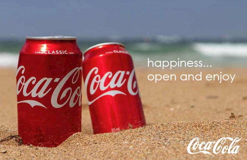
There is contrast with the red cans on the brown sand and the ocean and the sky in the background. The cans also have light on them; appearing to be sunlight which lights up the cans and makes them contrast more with their background. There is also contrast with the blue sky and the blue/green water and the brown sand as they appear to be in rows. The water also has some white foam in it which stands out. The white font stands out and leads your eye to the words.
In my ad, the bright red from the cans with the white logo from Coca-Cola stands out. Then you have the brown sand, the greenish blue water and the blue skies. These colors are calming and relaxing and warm. This appeals to people because it reminds them of summer. People love to spend time on the beach with family and friends. These all contrast with the white font; helping the font to stand out.
I have tried to recreate the typography used in the original ad at the top of the page. I have added the Coca-Cola logo, the same on the can in the bottom right corner and put a Sans-Serif font to the right of the cans. Your eye is drawn to the script first on the logo, and then to the sans-serif on the side. The sans-serif is simple and in two lines, tells you what the makers of Coca-Cola want you to know. Coca-Cola makes you happy.
When Coca-Cola had these ads made, they clearly wanted everyone to associate happiness with drinking a Coca-Cola. The first ad I have shown above associates Coca-Cola with someone sitting on grass, maybe with another person, on a bright sunny day. They are enjoying the beautiful sunshine and enjoying a Coca-Cola together. They tell you if you open a Coke, you will find happiness. On the new ad I created, it shows two cans of Coca-Cola on a beach. They are bright against the sand and the water in the background. A lot of people associate the beach, with vacation or relaxation, or just pure fun. Here you can open a Coke and enjoy your time on the beach. By showing another location where people find happiness, is how these two ads go together. They show no matter where you are, you can enjoy a Coke and that will make you happy.

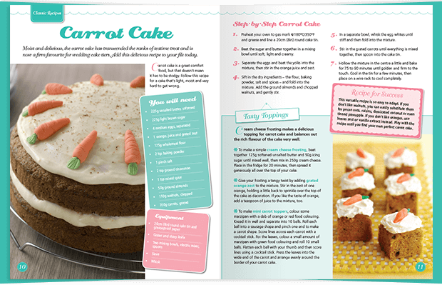
This 2 page spread comes from Cake Decorating magazine by DeAgostini. It is a how-to magazine on cake decorating. This 2 page spread deals with making carrot cake and decorating it. https://www.deagostini.com/uk/collections/cakedecorating/
There are two types of typeface used in this article. The first is the script used in the main header and all the sub-headers. You can identify the script because it looks like cursive and makes it looks fancier than the other type. The second typeface used in the article is a sans serif. We learn in our design book that sans serif is a monoweight, which means it does not have the heavier and light strokes, it just has one weight to the strokes.
The script used in this article is at the top of each new section. It is a fancier type and it sets the header apart from the sans serif type that is used in the body of text. They have also used different color text blocks for each new section, which helps with the contrast of the two different typefaces. The script is soft on the eyes and makes the carrot cake seem homemade and adds a contrast to the sans serif. If they just used sans serif, the page would be boring and the different sections would not stand out.
The photographer used shallow depth of field in this picture. The front pieces of carrot cake are in focus, while the back pieces are blurry. This helps the reader to focus on those front pieces of carrot cake. The reader is still aware of the back pieces of carrot cake, but the readers eyes will go to the front pieces which are in focus.
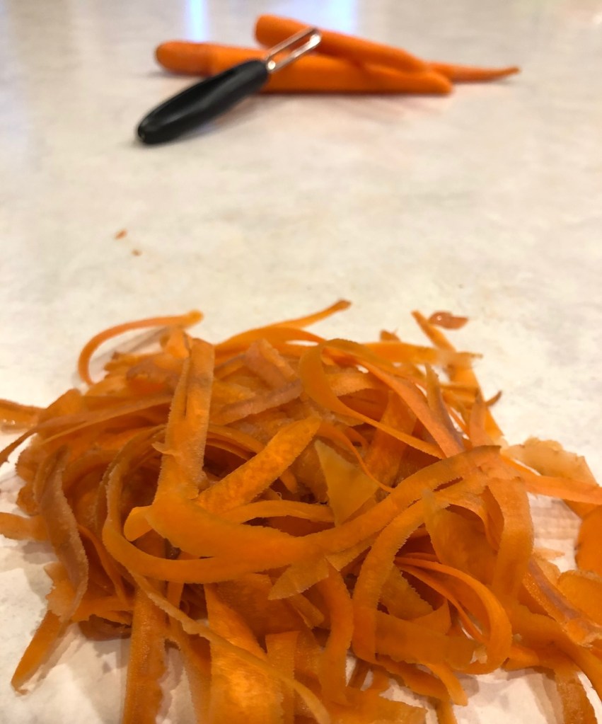
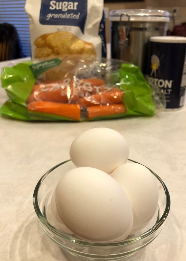
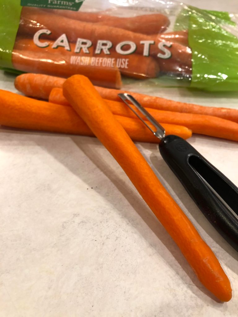
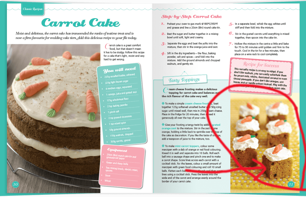
The three above images can be switched for the small pieces of carrot cake. The first picture shows fresh carrot peelings; showing that this recipe will have fresh carrots in it. The next picture shows ingredients to help make the cake. Since this page has a recipe on it, this could go in place of the finished pieces of cake, since we have a picture of the full cake on the right. The last picture is another picture of the peeled carrots. This tells the reader that this cake is homemade with fresh carrots. All three pictures represent the recipe on the page and all three have a shallow depth of field; the picture in the front is in focus and the back images are blurry.
When I look at this layout, it makes me want to make and eat this carrot cake, because I find it very appealing. The author wants this to be appealing; they are selling the customer on how they can make and decorate this carrot cake. The depth of field in the picture with the small pieces of cake takes your eyes to that front piece of carrot cake. The top of the carrot cake has a carrot created out of frosting, this is where the author wants your eyes to go. She is teaching you how to make this cake and decorate it, so it is appealing to your appetite and your eyes. I also think by combining the script with the sans serif, the typeface is not overbearing.The script is not a super fancy script, it almost looks like a basic handwritten cursive, it helps the page look nice, but not overly fancy or to much to look at it. The colors added into the layout also make the typeface stand out. I find the overall appearance of this add appealing to both the eyes and the stomach.
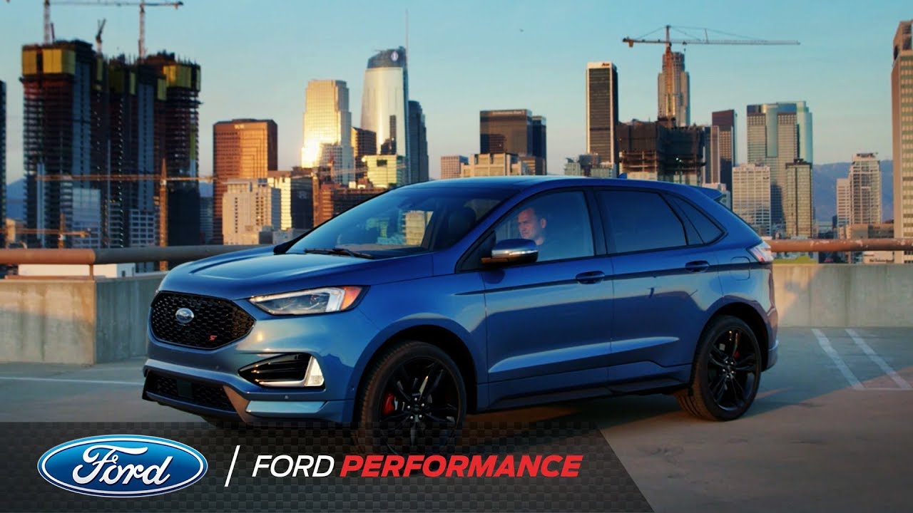
This week we learned about the 4 principles of design: Contrast, Repetition, Alignment and Design. I will show each of these principles used in an ad by Ford for their Ford Edge.

Link: Ford Ad
This still shot is taken from a You Tube Video on the Ford Performance Page. You can find the full video here: https://www.youtube.com/watch?v=RZrTyIdOj4M. The video was created by Ford to show the performance ability of the new Ford Edge ST. The Ford Performance YouTube channel has over 310,000 subscribers.
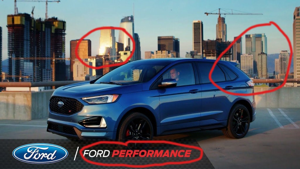
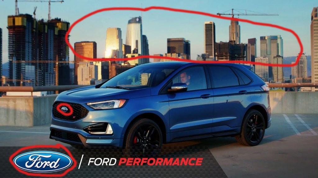
Per our reading this week, we learned that contrast is something in the ad that our eyes are drawn to. In this picture we see contrast multiple times. We see it in the sun reflecting on the buildings in the back. It is in the color difference between the building, the light blue sky and then the darker blue Ford. The white and red used in Ford Performance at the bottom also draws our eye to this text. When they created this ad, they wanted the reader to think that this car, the Ford Edge is associated with performance.
Repetition in design helps tie the page together. In this ad, the buildings are used for repetition as the backdrop to the car. We can also see repetition in the Ford logo which is not only on the car, but it is on the bottom of the ad.
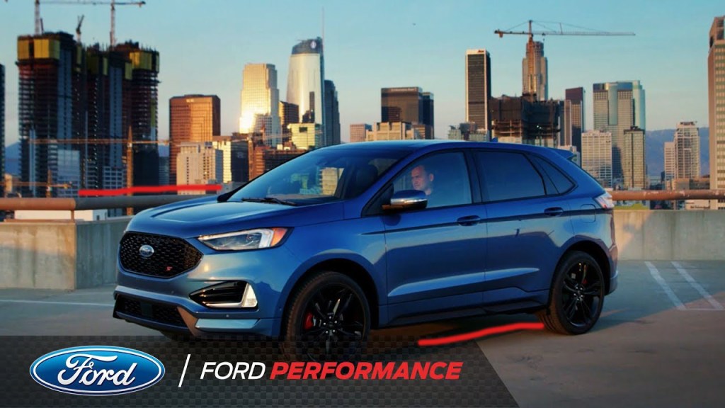
We learned this week that we should not place things wherever we want on a page, they should be placed so that they line up with other elements to make the design look better. In this design, we have the car parked at an angle, and if you notice the parking lot also angles back on the left side of the picture. The placement of the car in front of the buildings makes the car stick out. If it were parked straight on, you would not see the whole car and it would blend in. This way, the car is the focal point of the ad.
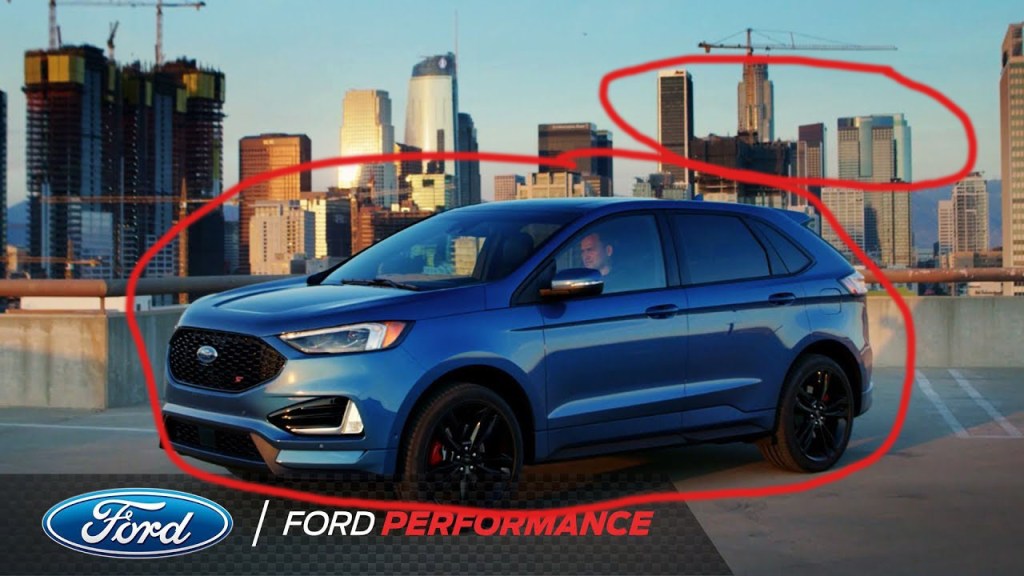
Proximity helps to organize the ad and make is pleasing to look at. This ad shows the car angled slightly in the parking lot with the buildings in the back. By putting the car in the front and making it larger with the cityscape in the back, it shows just what the creator wanted me to see, the Ford first and then the cityscape. We also see the Ford logo and Ford Performance at the bottom in close proximity to the car. This helps me as a viewer to associate Ford cars with Performance as previously stated.
I like this ad created by Ford. First off, the light blue sky with the darker blue car creates a pleasing contrast. The way they have added Ford Performance at the bottom of the ad helps me to know that this Ford is associated with performance. By placing the car in front of the cityscape, it stands out and it is the bigger item in the picture that you look at first, even though the buildings are much bigger in actual life. This ad is simple, without a lot of text, but I feel like it got the point across simply. Ford cars are associated with performance.
This is an example post, originally published as part of Blogging University. Enroll in one of our ten programs, and start your blog right.
You’re going to publish a post today. Don’t worry about how your blog looks. Don’t worry if you haven’t given it a name yet, or you’re feeling overwhelmed. Just click the “New Post” button, and tell us why you’re here.
Why do this?
The post can be short or long, a personal intro to your life or a bloggy mission statement, a manifesto for the future or a simple outline of your the types of things you hope to publish.
To help you get started, here are a few questions:
You’re not locked into any of this; one of the wonderful things about blogs is how they constantly evolve as we learn, grow, and interact with one another — but it’s good to know where and why you started, and articulating your goals may just give you a few other post ideas.
Can’t think how to get started? Just write the first thing that pops into your head. Anne Lamott, author of a book on writing we love, says that you need to give yourself permission to write a “crappy first draft”. Anne makes a great point — just start writing, and worry about editing it later.
When you’re ready to publish, give your post three to five tags that describe your blog’s focus — writing, photography, fiction, parenting, food, cars, movies, sports, whatever. These tags will help others who care about your topics find you in the Reader. Make sure one of the tags is “zerotohero,” so other new bloggers can find you, too.
